
Interior book design falls under the umbrella of “graphic design,” but it is often more subtle and discrete than many other types of graphic design. This is because the goal of the interior book designer is to make the reading experience easy and engaging, while avoiding design treatments that distract from the content itself. An interior book designer must juggle lots of text and, in some cases, special formatting and images. As such, it’s the interior designers job to strike a balance between aesthetics and readability.
When considering the aesthetics of a book, the interior book designer often falls back on many common book design techniques, which we explain below. These are, at least, our go-to type treatments when designing books for our clients and can serve as a jumping off point for your own project.
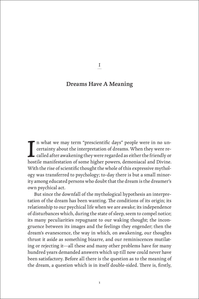
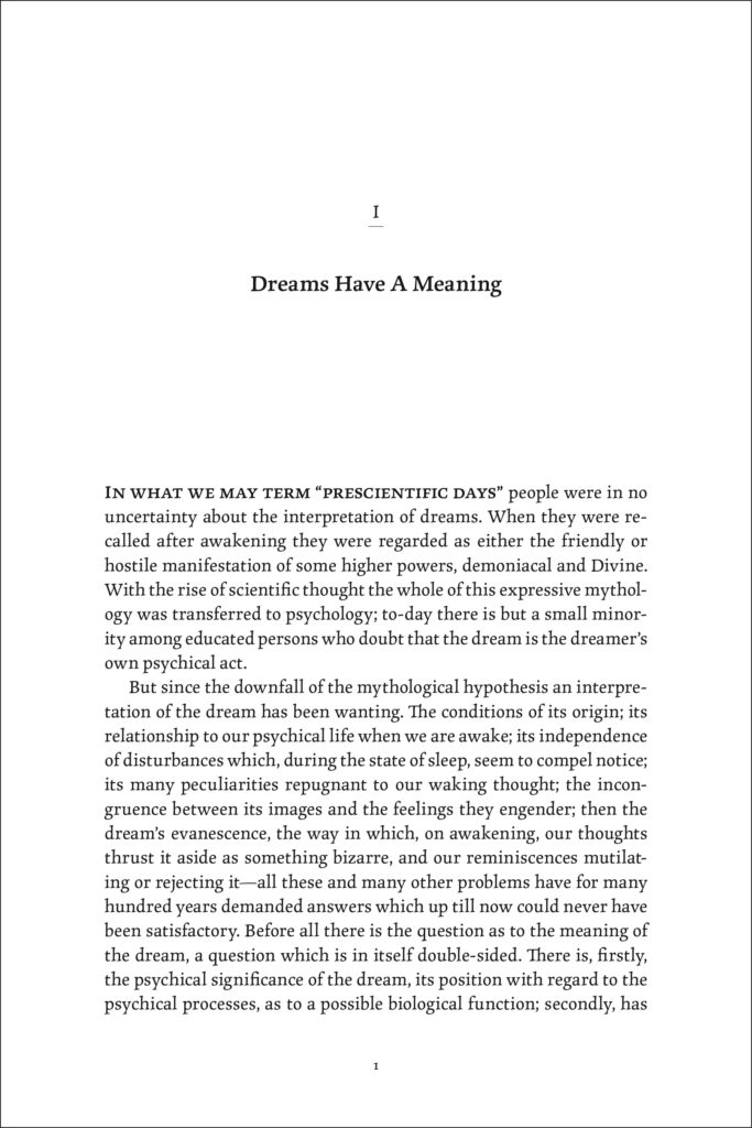
1. Drop Caps
Drop caps, one large letter at the beginning of a paragraph, can be used to create an impression on your reader. Most often, drop caps are used at the beginning of a chapter. They can be set in the complementary typeface to the overall text, or kept in the same typeface as the main text. The bigger the drop cap, the easier it will pull the attention of the reader to the very first line of the page. This is a great technique for getting your reader to actually start reading your book.
2. Lead Lines
Lead lines are similar to drop caps but are a bit more subtle. Instead of one large character in a contrasting typeface, the first few words of an opening paragraph are set in a contrasting typeface or are distinguished from the main text in some way. Lead lines work great when there is already a lot of design happening on the page, but you still want to pull your readers attention to a particular spot.
3. Glyphs and Dingbats
Glyphs and dingbats (yes, there is such a thing!) are typography terms for decorative characters made available through different typefaces. Depending on the spirit and style of your book, glyphs and dingbats can be a great option for additional decoration. Usually, they are placed near page numbers, in section breaks, in the table of contents, on part openers, and/or on the half-title and full-title pages.

4. Pull Quotes
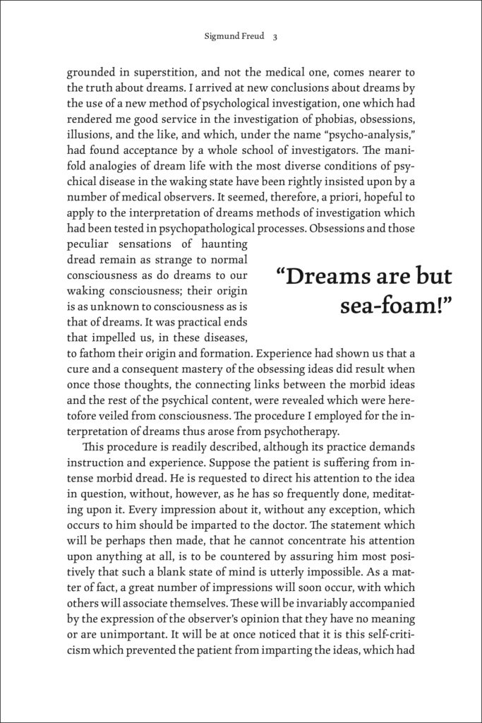
A pull quote is a unique type treatment often used in magazines or anthologies. Some nonfiction books, depending on the content, may use this technique as well.
How they work: An exact phrase, sometimes shortened in length, is pulled from the main body text and set in a larger font size. The phrase is then placed within the text and the main body text wraps around it. Depending on how the book is set up, the pull quote may stick into the margin or be placed between columns of type. Pull quotes are an effective way to convey a particular point and add some variation and excitement to the page.
5. Font Case + Tracking
Using different font cases is a simple way to emphasize a particular element on the page. There are multiple types of font case: lowercase, uppercase, title case, sentence case, and small caps. The most common choices among regular type is, of course, title case and sentence case. Many designs, however, benefit from using uppercase or small caps. In general, only special elements like chapter or poem titles would use a specialized treatment like this.
Tracking is the term for the space between words. Adjusting a word’s tracking is a quick and easy way to add emphasis to type elements. The default tracking is zero, but you can decrease or increase the tracking to fit a particular style. Tracking outward (increasing the tracking) is usually the way to go when wanting to make a particular type element stand out. This is because as you increase the tracking you increase the white space that surrounds each word and letter, giving that phrase more real estate on the page.
Tracking in conjunction with using all caps or small caps goes a long way to enhancing the aesthetic of a book. Books with this type treatment often look classic and elegant.
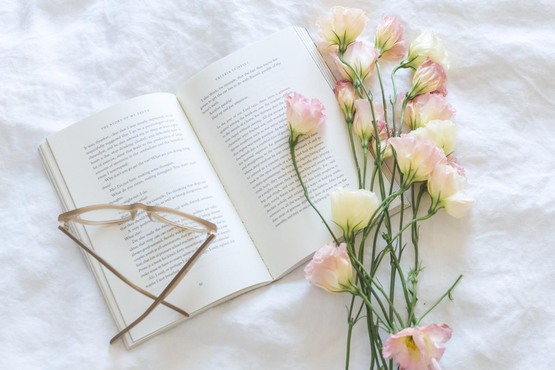
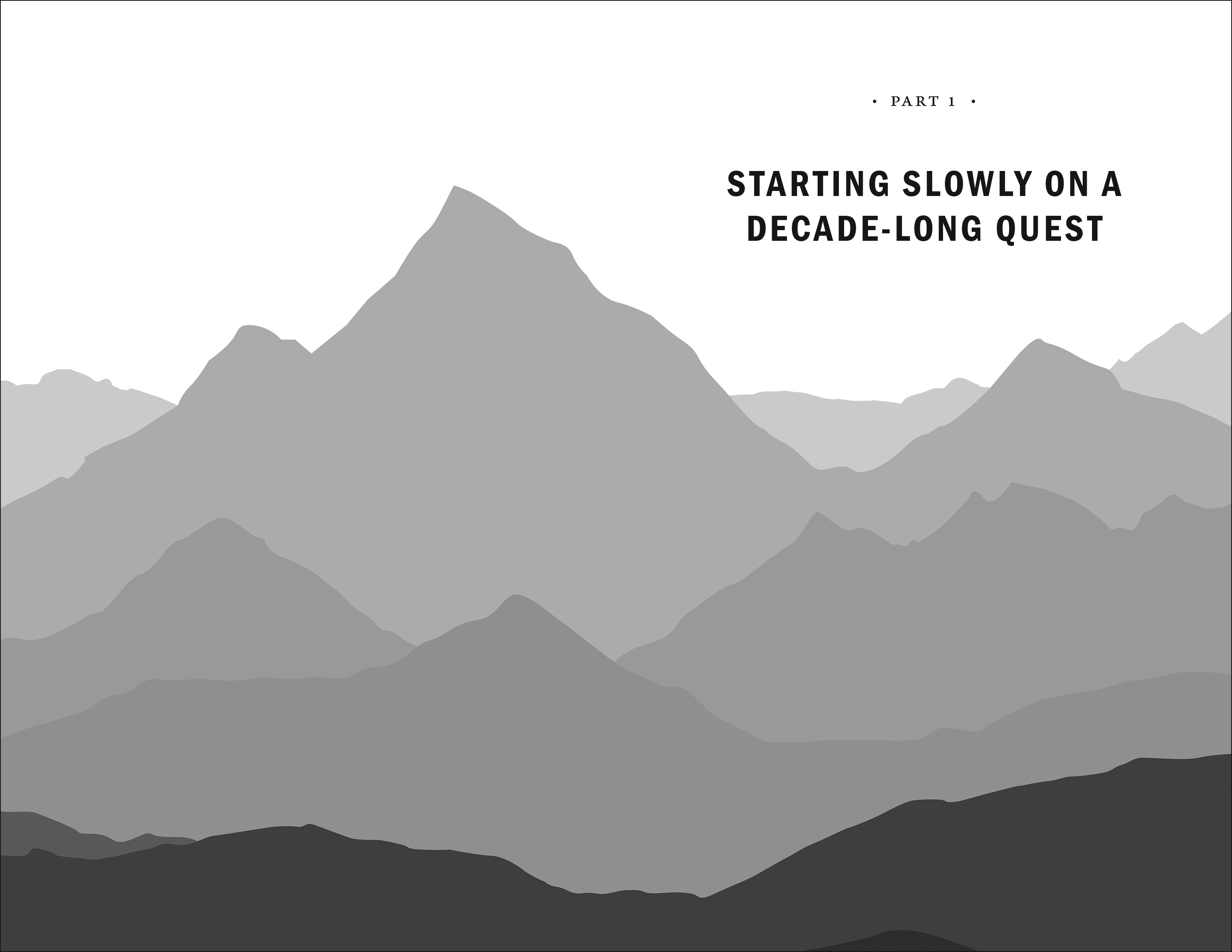
6. Graphics
Using images throughout an interior design is fully dependent on the content of the book. Image heavy books will already use lots of graphics, so it might make sense to use graphics throughout for interior design purposes, too. Other books are text heavy, so graphics may not be the best fit when considering interior design.
Images can certainly add a level of intrigue to the page, but they can also be distracting if used too much or in the wrong places. Common places for graphics to appear for interior design are on the title page, part opener pages, or chapter opener pages. Often, the final cover design will be used as inspiration for how to use graphics throughout the interior of the book.
Employed successfully, graphics can be a great way to integrate the content, theme, or cover of the book with the interior design.
These are just a few ways a book designer can make an effective and engaging interior design. Depending on the content, there may be even more ways to make a statement to readers. Contact us for a custom design estimate, and let us know what design ideas you have for your project!